What Font Does Instagram Use? Instagram Sans Guide
Instagram uses its custom Instagram Sans family across brand and product contexts, while interface rendering can vary by platform and system text behavior.
Short answer
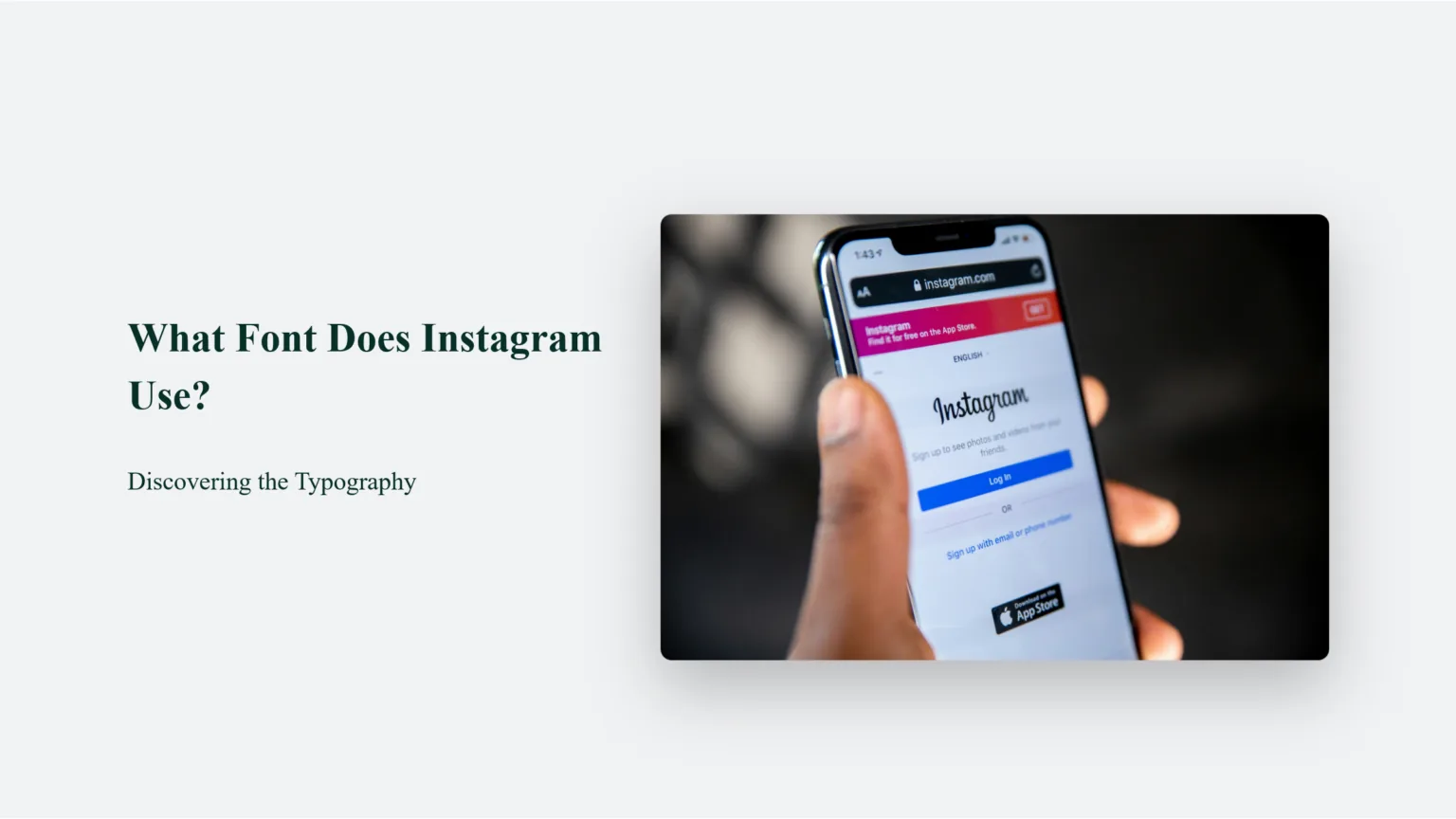
Instagram's official custom typeface is Instagram Sans, introduced with the 2022 visual refresh and designed in styles including regular, headline, and condensed treatments. Some interface text and user-entered content can still render through platform, language, accessibility, or fallback fonts, so not every word on Instagram is one identical font file.
Key takeaways
- Instagram Sans is Instagram's official custom brand type family.
- The family was introduced as part of Instagram's 2022 visual identity refresh.
- The wordmark, marketing graphics, in-app interface, and Story text tools do not necessarily use one identical style.
- Operating-system, language, glyph coverage, and accessibility settings can cause fallback fonts.
- Instagram's brand typeface is not automatically licensed for unrelated logos, products, or commercial redistribution.
What is Instagram's official font?
Instagram's official custom type family is Instagram Sans. It supports the brand's identity across product and communication, with multiple styles suited to headlines, interface use, and expressive layouts.
The answer is more precise than naming a common system font such as Helvetica or Roboto. Instagram previously relied on different platform and brand typography, while the custom family created a more recognizable visual system. However, an Android label, an iPhone menu, a Story sticker, and the Instagram wordmark can still look different because they serve different purposes.
For useful context, compare optimize an Instagram bio with write a clear Instagram bio.
How can you identify an Instagram font in a screenshot?
First identify the surface—wordmark, app interface, Story text, caption, or marketing artwork—then consider device, date, language, and accessibility. A screenshot alone may show a fallback or user-selected style.
- Locate the text within the product: logo, navigation, caption, Story creative tool, or campaign asset.
- Record the device and operating system because interface rendering and system fallbacks differ.
- Check whether the screenshot predates the 2022 Instagram Sans refresh.
- Look for non-Latin characters or missing glyphs that require a language-specific fallback.
- Compare with Instagram's current official brand typography examples rather than a random font-identification site.
- Review licensing before using any similar typeface in a logo, client project, template, or app.
Font-identification tools can suggest visual matches but cannot prove the exact file, weight, tracking, or custom modification. Use official brand resources when accuracy matters.
These steps also pair well with write Instagram captions and improve Instagram search visibility.
Why do different parts of Instagram use different-looking fonts?
Different surfaces use distinct weights, widths, rendering engines, creative styles, and fallbacks. Instagram Sans is a family and brand system, not one unchanging appearance.
| Surface | Likely typography source | Why it varies | Can users choose it? |
|---|---|---|---|
| Instagram brand materials | Instagram Sans family | Brand art direction and custom layouts | No |
| App navigation | Product typography plus platform rendering | Device and UI version | No |
| Story text | Creative text styles | Selected effect and language | Yes, from offered styles |
| Caption text | App UI rendering | OS, language, accessibility | No direct font upload |
| Username bio symbols | Unicode characters and fallback fonts | Glyph support | Characters can be entered, font cannot be guaranteed |
So-called Instagram font generator sites usually output unusual Unicode characters, not a real font installed in the bio. Those characters can be inaccessible to screen readers, difficult to search, and unsupported on some devices.
To choose the right option, keep publish Instagram content and plan Instagram content nearby.
Why does copied Instagram-style text look wrong?
The text may use unsupported Unicode, the receiving device may substitute glyphs, the weight or spacing may be wrong, or the user copied a visual approximation rather than Instagram Sans.
- A fancy-text generator replaced letters with mathematical or decorative Unicode symbols.
- The device lacks glyph coverage and shows boxes or inconsistent fallback characters.
- The screenshot uses a condensed or headline style while the imitation uses a regular width.
- Letter spacing, size, antialiasing, and background contrast differ from the official layout.
- The Instagram app changed design after the reference screenshot was captured.
For accessible profiles, use ordinary characters in names and bios. For design work, choose a properly licensed typeface and recreate the hierarchy rather than copying a protected wordmark.
If you hit a related problem, consult build an Instagram presence and create a readable Reels hook.
Can you download and use Instagram Sans?
Use only the files and permissions Instagram officially makes available, and read the associated brand terms. A brand typeface or logo asset is not automatically free for unrelated commercial use.
Do not package the font into templates, apps, merchandise, or a competing identity without a license. Avoid creating a logo that could confuse people into thinking Meta or Instagram endorses a product. For ordinary social graphics, a licensed alternative with similar functional qualities—clear forms, good language support, and accessible weights—is safer than an unauthorized copy.
For privacy and account safety, also review understand Instagram ranking and handle Instagram profile imagery safely.
What font should you use for Instagram content?
Use a legible, licensed font that matches your own brand and remains readable on a phone. You do not need Instagram Sans to make content feel native.
- Choose strong contrast and a large mobile-readable size.
- Use no more than a small, consistent type hierarchy.
- Test language characters, captions, and screen-reader-friendly text.
- Keep the Instagram wordmark and brand assets within official guidelines.
Content clarity matters more than an exact visual imitation. A distinctive but accessible brand type system also helps viewers recognize your work rather than confusing it with Instagram's own interface.
Frequently asked questions
Instagram's official custom type family is Instagram Sans, introduced with the 2022 visual refresh.
Sources
Keep reading
More guides to grow your account.